26 Apr 2013

IS HE ALWAYS RIGHT?

If you are a web designer, it is highly probable you found yourself in specific stalemate situation, in more than one occasion.

For start, let suppose your client provided you with detailed info of what his new, awesome, spectacular, web site needs to achieve. (Yes it happens sometimes.)

So you bury yourself in statistics, psychology, UX studies etc….

(For your personal amusement, check out a nice “little” collection of studies by Nielsen Norman Group, at www.nngroup.com/topic/human-computer-interaction/.)
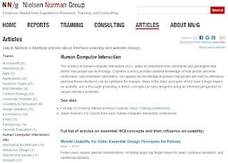

nn group

And after days of research and experiments you come up with design that will meet client’s demands just perfectly, right? Well…

Your client might be big company which appointed their marketing experts to cooperate with you in designing that pages. Through the dialogue, you’ll get to the final solution, no problem.

Your client might be a small business owner who is aware of his knowledge and he entrusted the design to you completely, not bad also, of course.

But what if your client thinks he did his own homework, if he saw couple of web sites of his most fearsome business rivals? Worse yet, their pages are flashy masterpieces made in 2004… Never mind, typography, paragraphs width’s, trendy-schmendy… he wants to beat that epileptic trigger with his own weapon.

Suddenly you are at a crossroad, make a stand or make something that will make every bit of your brain scream against. Lose your client, or lose your integrity? Answer to that question depends on many factors, and in principle, it’s a subjective matter, but no need to make radical decision. Well, at least, not yet.

Try subtle approach at first. Sum all advantages of your design. Then translate it to short, direct, geek free sentences, (e.g. “SEO friendly” = “easier to find”), and write it down. Do the same with client’s proposition disadvantages too, (e.g. “That font tends to pixelate at smaller ppi” = “Text won’t look nice on most of the screens”). Now present that nice little essay to your client, and see what will happens.

The point is, although your client might not share your level of knowledge when it comes to web technologies (and of course, he don’t need to), it is highly likely he possess common sense. If you prepared your arguments, pros and cons, right, chances he’ll listen aren’t small.

As a last resort you can try persuade him to read that Nielsen-Norman research papers I mentioned earlier, or look at 10-web-design-trends-for-2013.html, but somehow I don’t think it will happen.


2013 trends

Client is a person who gives you his trust, and his money, thus, he is a person who deserves your respect. You, on the other hand, are giving him best of your knowledge and time. If you do your job ethically and professionally, there is no reason not to respect yourself. Fulfill these two conditions, and there is a big chance you’ll achieve mutual understanding.

And if you don’t, its not that tragic either. Stand up for yourself might not be always profitable but you’ll sleep much nicer, believe me.

Thanks to www.nngroup.com and www.awwwards.com

13 Apr 2013

ENOUGH WITH SHENANIGANS!

As I mentioned earlier, one of the trends this year, is focus on content. If it means that we’ll be able to clearly see, information that we need, well hail to the new trends.

Wait, was that one of design’s primary functions from the beginning of time? Of course it was. But what made it stray from it’s course? Well humans are by nature, curious creatures. On the other hand the bombardment of new technologies, software and hardware possibilities, naturally, created eco-system that exploited that side of human character. It literally dragged people’s minds in to experimenting. Well in that plethora of web pages, surely some experiments were less successful than others. Just check out exapmle below, and you’ll see what I mean.


Wow!

Luckily it looks like those days are over. Being, what it is, a human’s helper, technology constantly evolving, finding its way of serving best to the interests of people. Currently seems to be in calm waters of portable, touch screen computing marvels, commonly known as mobile phones or tablets. Wireless networks also are all around as. Ergo, we are constantly splashed with waves of informations, and tons of them. Add to that a modern tempo of life, and you’ll get necessity to reach, process and absorb quite specific information, and to do it quickly.

And right there is the point where more traditional design values regain there domination again. Those values were around us all the time. Take, for example, some known newspaper, there is a reason why their page’s design lasted for decades.


Frankfurter Allgemeine Zeitung

Guidelines of such design are not to hard to reckognize. Its just that design became more delicate and descrete.

Nice, noticeable headlines to make your visitor sure that he is on the right page. Whitespace to make page flow more natural. Carefully about your page’s typography, to make that info as readable as possible and paragraphs sized for comfort.

When it comes to HCI do not experiment, at least do not do it extremly. Since you are not able to handpick your visitors, relay on most common human habits, keep it simple and make navigation through content, clearly visible and understandable. Avoid ornamentation, cause graphic elements should be there to illustrate and direct the eyes, not to confuse and distract them, and you’ll be right on track.


See what I mean?


Keep in mind: “The best design is the simplest one that works”- Albert Einstein.

Does all this mean that all that visual shenanigans will die. Don’t think so, but surely hope some of them will.

Images provided by: tpgblog.com, netzwertig.com and trychec.com

12 Apr 2013

DON’T GET LOST (IN YOUR SHEETS)

Browsing is in the air and everywhere, from smartphones to the smart TV’s. Such variety of screen sizes got birth to one quite cute method for creating style sheets that adjusts your HTML just fine, for every screen. It is known to all by name of responsive web design. It sizes the headlines, move DIVs and float paragraphs just like a charm. Like many, I got right in to it with mouth wide open. Typing and typing like there is no tomorrow. At this point you might ask, what this is about, where this guy is going with this, well…
classic layout


Assume you are freelancer, doing all the coding by yourself. Few pages including forms, images, tables, etc. and you probably found yourself in the maze of code lines, not knowing where is that one particulate selector, you need ASAP. For god sake, you just want to change font color to red! If, as we usually do, separate screen sizes in tree most common groups, 0-480px, 480-780px, 780px and above, it is quite possible that work of writing appropriate CSS can triplicate itself. So what can we do to avoid getting lost in that mishmash of code lines?
moblie layout


Big problem is often solved more easily when divided into few smaller. Following some simple steps, through procedure of creating CSS, made my sheets much more readable and easy to navigate. Well, here’s what I did, and maybe it will be of some use for you either.

1. Know how every good movie has a good scenario. Why don’t I write my own scenario, better yet, a storybook? Point is to have sketches of your pages, with main elements of those pages on paper. Sketch every page, name the elements and mark their changes. After days of typing it’s easy to get confused about your thoughts and ideas. One look at your storybook will get you right back on the track.

2. Group your elements. Make group of elements by their significance and specificity. Start with main containers and define their dimensions, positioning etc. Then define headlines, links, and paragraphs in general, for all the screen sizes you are designing for. By doing this you’ll have your page behave just as you planned.

3. Now for fine tuning. Check out that storybook from the beginning and shape up main container’s (DIVs) specific content. Whatever that can be, text, links, tooltips etc. it simplifies finding that specific rule if you clearly distinct it from the rest of code. Of course, don’t forget to include comments in your sheets. It is always good practice.

4. Crazy little thing called form… is easy to style…, yeah, sure. Anyone who tried to step out of box of predefined rules imposed by browsers and OSs know what I’m talking about. So what should poor designer do? Should he put another couple of hundreds lines of code to already pretty nice pile. Of course not. Simply put it aside! Well not aside for good, otherwise, how can you make that astonishing look? Create that neat style sheet just for your cool looking form. Consult those sketches again and think for a second, where that form will fit just fine. What’s left is to call it’s own special style sheet when and where is needed and voila.

You’ll have your pages shaped up just as you intended, fitting nicely on every screen. Best of all, your style sheets will be neat as they can be, making it easy to find your way around, anytime you need to.

10 Apr 2013

WHAT ABOUT THAT TYPOGRAPHY?

One of trends in web design, coming our way this year is focusing on content. Assuming significant content of the page is foremost presented by text, readability of that text tends to became focus of designers attention. Helpful fact is the abundance of fonts available to designers through webfont-kits.

On the other hand that same abundance includes font types whose optimization for screen media type is, at least, pretty questionable. Responsive design in that case makes things even more complicated. One pretty font face on 1024px screen, could became quite ugly on 1080p, or unable to read on that 332ppi of those little perfect devices in our pockets. Even worse, problem is quite complex, and includes many aspects, such as ligature, heights, anti-aliasing, etc...

Other that those traditional techniques for improving text rendering, CSS seems to be in searching of something new, better, but how successful? Acrobatics and tricks with CSS's new rules, by my modest opinion, till now didn't offer worthy results.

Check out the "font-smoothing" rule example in a picture below:


font-smoothing rule


Maybe you see some difference, either my sight have weakened or have a crap of screen (which I doubt), but I don't. Yet, if you do, keep in mind that that particulate rule is supported only by webkit browser engine.

Other, at a first glance, witty trick should be "text-rendering" rule, which should instruct browsers what to optimize, when rendering text ( developer.mozilla.org/en-US/docs/CSS/text-rendering ). Let's see how that turned out:


text-rendering
There we have "text-rendering" property with "optimizeLegibilty: value. Any spectacular results, no?

Well, what to do than? Abundance of choices is mainly good thing, but as templar knight said to Indy, "choose visely"! On-line tools such as www.fontsquirrel.com or www.google.com/fonts/ not only provide plenty of font faces, but also provide a nice previews. Use them, and use them intensively. Use your tablets, phones etc. and you'll see how they behave on various screens. That should make your decision much easier.

Combine your choices with that text-shadow, line-height, letter-spacing, and so on, CSS properties and you'll achieve nice results, no doubt. Even without braking your brains about ligatures and kernings...


Thanks to maxvoltar.com and aestheticallyloyal.com on nice examples